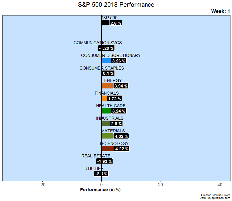
This animation illustrates how the S&P 500 changed over the year and what drove its performance.
The overall S&P 500 index performance is at the top and below it is the breakdown of the index by sectors. (The background image shows the actual index levels for reference.) The percentage moves are weekly and the top right-hand corner shows which week of the year is being viewed. Also in the top right corner, viewers can see the news and events causing the sectors to move.
The data source for this visualization is: us.spindices.com and the animation was programmed in R.